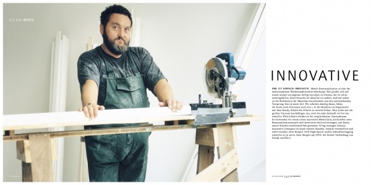
Zündel develops and cultivates brands.
competenceportfoliotechnologymediatourismculture about Zuendelone is simple:
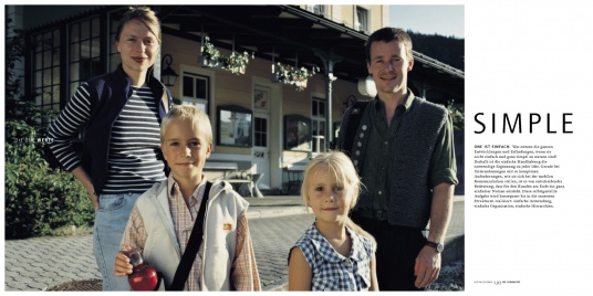
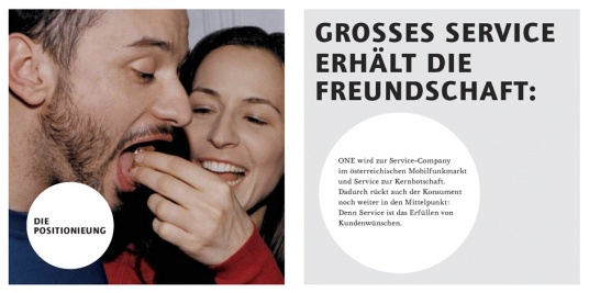
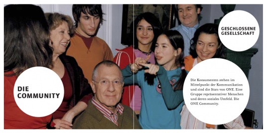
In 1998 mobile telephony was not only perceived as complicated by the consumer - it actually was complicated. This is why one adopted simplicity as its guiding principle. Simple products, simple tariffs, right through to simple corporate structures and hierarchies.
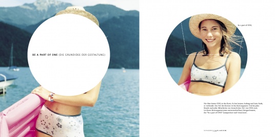
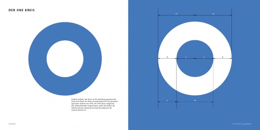
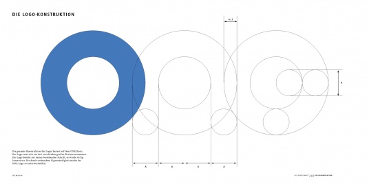
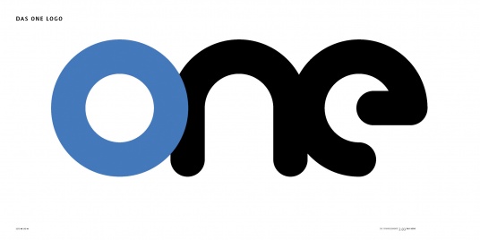
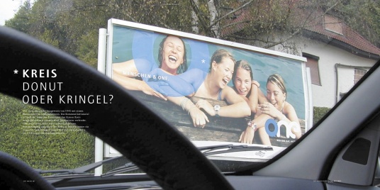
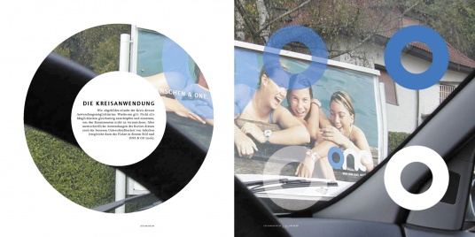
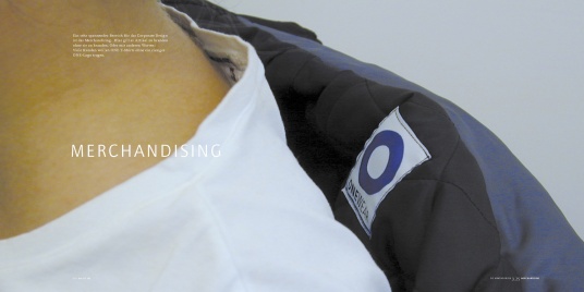
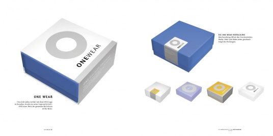
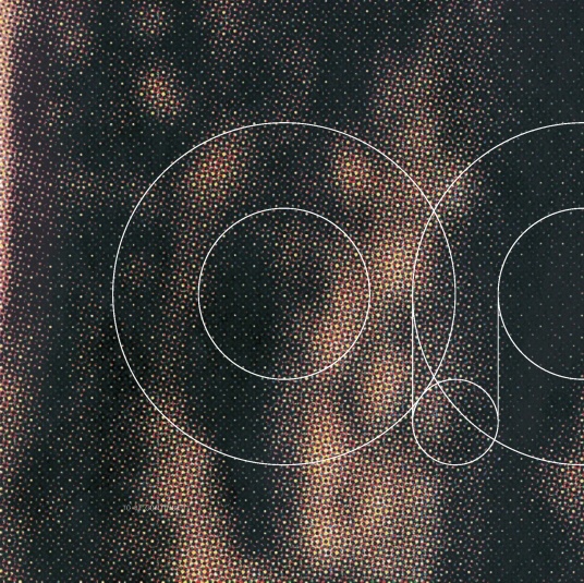
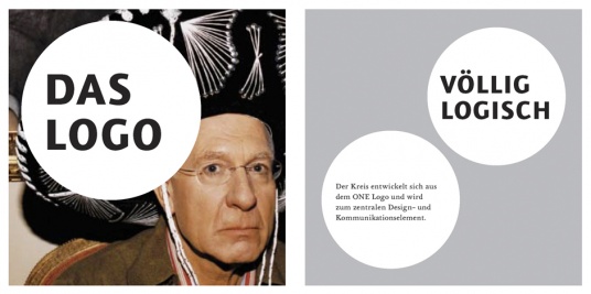
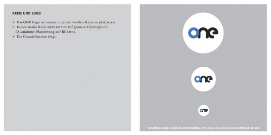
Of course, this also applied to the brand identity, perhaps even more so. The circle is the simplest form in nature, making the circle a clear choice for the main design element and leading to a logo created entirely out of circles.
Zündel Branding developed the brand along with positioning, corporate design, logo and communication for DMC - Design for Media and Communication. From 2003 to 2007 Freude - Hagmann und Zündel took on responsibility for design support, from classic communication through to product development.
Orange acquired one in 2008 and the brand disappeared from the Austrian market.
www.dmc.at
(for more see one communication case study)
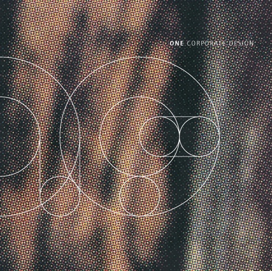
The 1998 one corporate design manual:
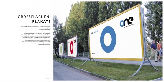
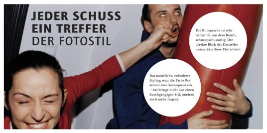
The cover of the Corporate Design Manual consisted of different sections from billboard posters, making every single copy truly unique. Several judging panels thought so too and this manual won awards in creative competitions in New York, Montreux, Berlin and Vienna. Here´s a little peek: 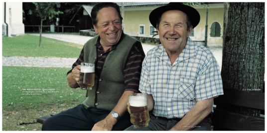
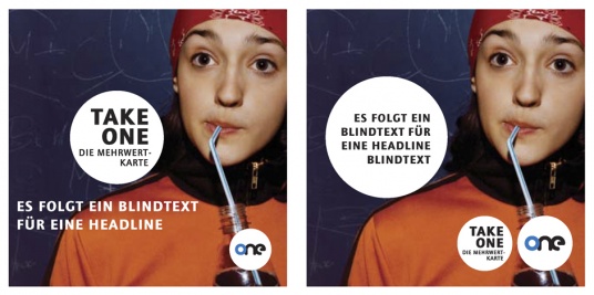
Redesign 2004:
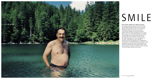
Consumers and in particular the competition had turned mobile communications into what was probably the fastest growing industry of all. This is precisely why it was necessary to hone the brand´s personality periodically and adjust the tone, in order to convince consumers that the brand was steadily growing and developing.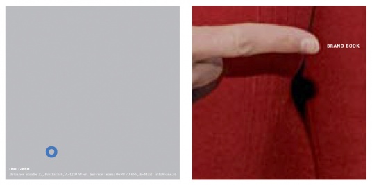
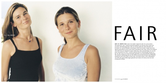
(Photos by Peter Calvin, Markus Rössle, Udo Titz and Wolfgang Zac)