Zündel develops and cultivates brands.
competenceportfoliotechnologymediatourismculture about ZuendelA broadcaster is coming of age - and so is its logo.
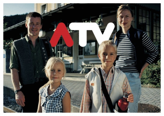
When it was clear not only from the increasing ratings that ATV had grown out of its training wheels, we were invited to let the public in on this. Our incentive to strip everything down to the bare essentials could be seen most clearly in the tiny broadcast logo placed in the corner of images. However, clarity and sleekness do not only promote brevity, but also a confident charisma, showing an ability to face new challenges and clearly announcing ATV's ambitions.
We developed the logo in 2006 as the Freude - Hagmann und Zuendel advertising agency.
www.atv.at


