Zündel develops and cultivates brands.
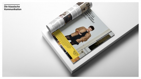
competenceportfoliotechnologymediatourismculture about Zuendel1 picture > 1.000 words
It is well known that a picture can say more than a thousand words and a consistent visual style is a key instrument in defining the tone of a brand and increasing brand recognition.
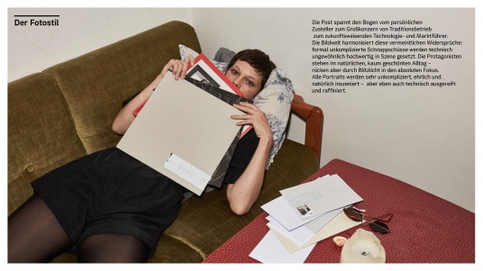
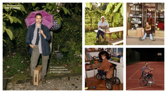
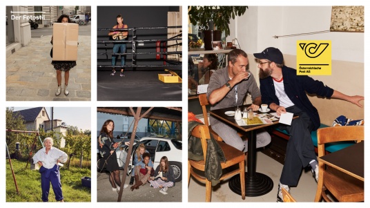
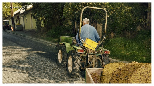
The Post covers a wide range from personal delivery to large corporation activities, from a traditional company to a forward-looking technology group. The pictorial world also resolves these apparent contradictions. Formally simple snapshots are edited in an unusual high-tech manner. All the protagonists are engaged in their everyday lives - but a flashlight moves them into absolute focus. The skilful portraits were staged by Wolfgang Zac and Klaus Vyhnalek in a
very casual, honest and natural way. At the same time, their technique is extremely advanced and highly sophisticated.
(for more see Post case study)
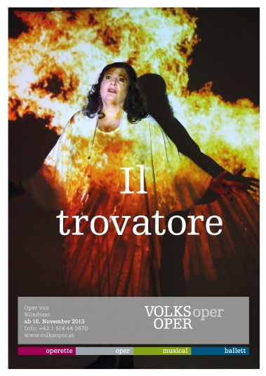
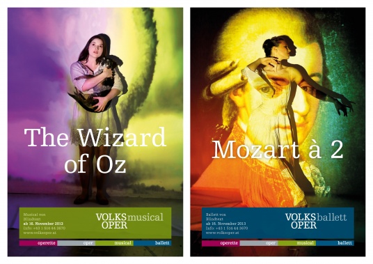
 Volksoper Vienna:
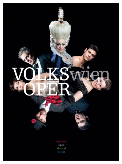
Light is an exceptionally authentic stylistic element for a theatre. Projections allow the protagonists to be transported to an infinite variety of worlds quickly and easily. Even though the character of every production can be presented with great freedom in terms of visuals, the style is consistent and unmistakeable. The projection trick brings together the fire of Trovatore, the vengeance of Sweeney Todd and the tornado in the Wizard of Oz and brilliantly communicates the Volksopers brand promise - that no other theatre in Vienna boasts so much variety under a single roof.
Photos by Barbara Pálffy.
 (for more see Volksoper Vienna case study)
Bregenz Festival:
The worlds largest lake stage has an astonishingly commanding natural backdrop in the form of Lake Constance. We used the lake as a flexible event stage - allowing productions from an array of genres, from orchestral concerts to drama to Opera Buffa, to be staged with great variety - while always being exceptionally accessible.
Photos by Wolfgang Zac: www.wolfgangzac.com
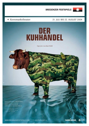
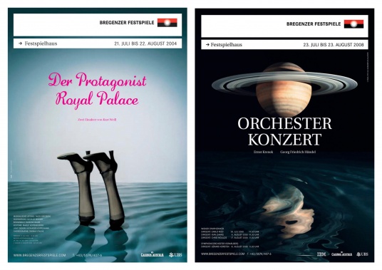
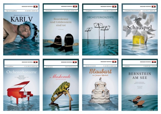 (for more see Bregenz Festival case study)
one:
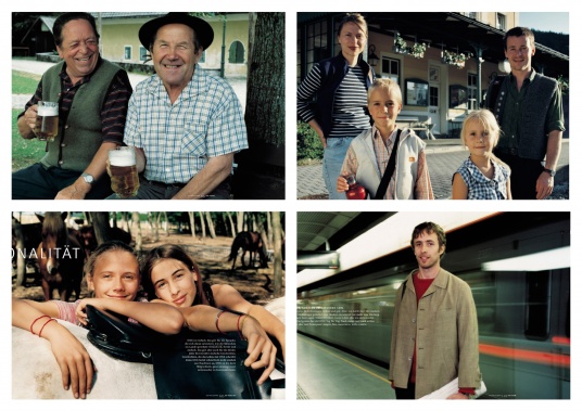
In 1998 the world of advertising was dominated by glossy, touched-up models - staying true to the brands top priority 'Simplicity', we presented real people honestly, authentically and simply. We presented this Austrian reality for eight full years in all of the media and one was rewarded by being named the 'most appealing' and 'most honest' mobile operator in every survey of the period.
Photos by Peter Calvin and Udo Titz: www.udotitz.com
_resized.jpg)
 (for more see one case study)
Paybox Bank:
Paybox Bank was not only the worlds first bank from a mobile operator - Paybox Bank also invented mobile services such as mobile parking payment. Paybox Bank is always thinking ahead, always reinventing banking, illuminating the issue of mobile payment from every angle, never ignoring any perspective, and quite simply turning payment on its head. This is exactly what the images show.
Photos by Wolfgang Zac: www.wolfgangzac.com
_resized.jpg)
_resized.jpg)
 (for more see Paybox Bank case study)
(for more see Paybox Bank case study)Neu Marx (New Marx):
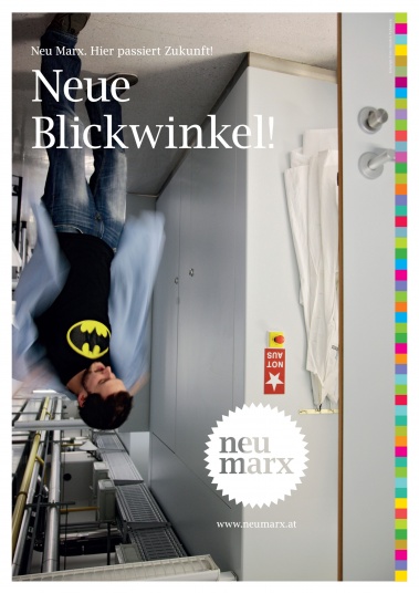
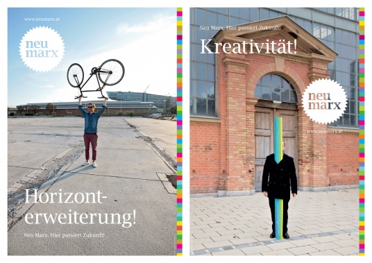
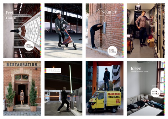
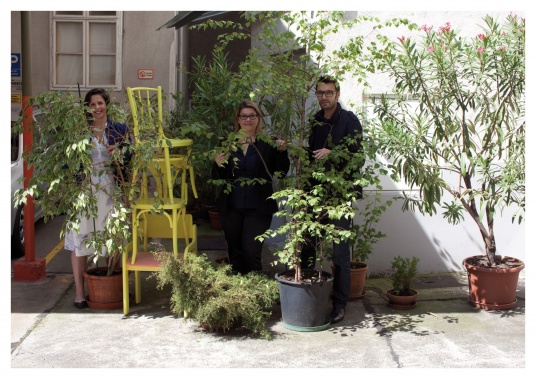
'New Marx' is a business site in Vienna which is already home to more than 100 companies from new industry sectors. Its not only about the unique international site or the imposing architecture - its actually about the people who share ideas, who drive and inspire each other. And it is precisely these people who we depict - consistent, uncomplicated and also new for a business real estate project.
Photos by Klaus Vyhnalek: www.vyhnalek.com
 (for more see Neu Marx case study)
Play:
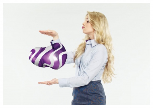
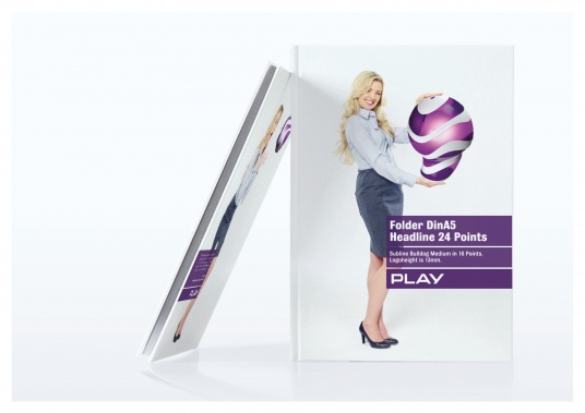
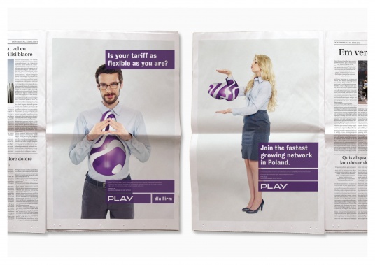
For Polish telecoms provider Play we simply took the so-called Blobb logo, modernised it, made it more realistic and implemented it into our daily lives. This made Play an appealing everyday feature. The high-impact stylistic element defines and drives the visual identity in classic communication as well as in literature or at the POS.
 (for more see Play case study)
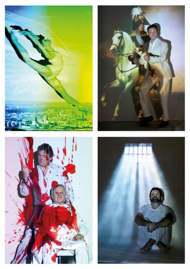
Volksoper 2.0
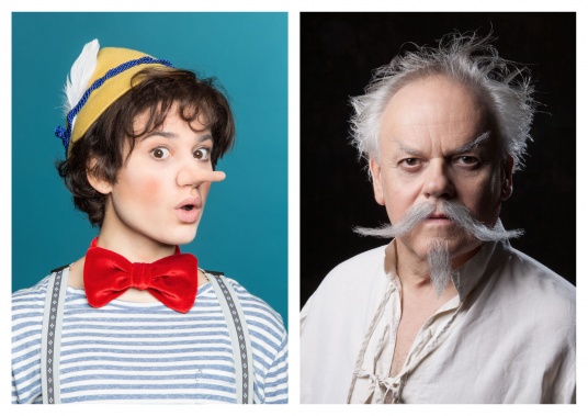
The singers and actors are the soul of the Viennese Volksoper. At the end of every play they have turned blood, sweat and tears into applause. The gifted performance and cooperation of actors, stage-crew, costume designers and make-up artists brings vindictive desperados and romantic lovers to life.
Photos by Johannes Ifkovits.
_resized.jpg) (for more see Volksoper Vienna case study)
(for more see Volksoper Vienna case study)goood
goood is rather a community, trying to make the world a little better, than an mobile communications band. The photographic style is designed to show this at first sight: Selfies represent smartphones as well as informal and fast communication within groups. Their 'production' is simple and cheap and permits a consistent image of brand ambassadors, NPOs or even product features.
_resized.jpg)
_resized.jpg)
 (for more see goood case study)
Vienna Design Week
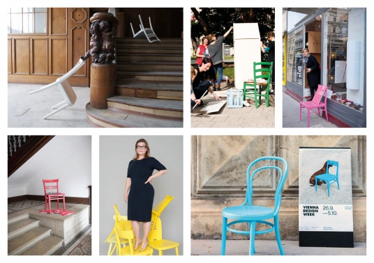
Chairs 'are' design. That is why we chose them as brand ambassadors for the Vienna Design Week. Painted in a different striking colour every year they are used for event-branding at almost 100 sites. Chairs - most of them on 4 legs - stand in the centre of the communication. Designer, sponsors and producers put themselves into scene with an individual chair. Various photographers, designers and agencies have been re-inventing our basic chair idea for more than 10 years now.
(See more Photos here: www.viennadesignweek.at)
_resized.jpg)
_resized.jpg)
 (for more see the case study)