Zündel develops and cultivates brands.
competenceportfoliotechnologymediatourismculture about ZuendelIn the process of developing a brand we concentrate on three main areas:
empathic analysis,
precise strategy
and consistent realisation.
We analyse the needs, the visions, the market backdrop and opportunities, and above all the aspirations of the target group. We then translate these into a comprehensible, believable story, which is not only easy to explain, but a pleasure to explain. We dont spend a great deal of time and money analysing things to death - our experience gives us the luxury of being able to trust in gut feelings. But the right way forward can only be with your head and your gut - and then the translation into design and communication is suddenly simple and logical. After all, intelligence and emotion are the most important ingredients for a strong brand.
We have been involved in the branding process at every different stage of brand development. Most of the time the market situation and the life cycle dictate whether the brand's appearance needs a complete overhaul or just some gentle adjustments. The examples of three mobile operators are a good way of demonstrating this spectrum:
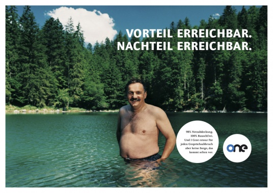 Market launch - demonstrated by one in Austria:
In 1998 one entered the Austrian market as the third network operator. At the time mobile communication was still a complex issue, but one showed that it was possible to make services and even price plans much more simple. Naturally we also took this approach and designed a logo consisting solely of circles, the simplest form in nature. The brand's tone was Austrian but of an international standard, in an advertising world which was at the time dominated by glitzy, showy models, we placed real Austrians centre stage - this was authentic, appealing, simple and just the right thing for a young challenger.
(for more see one case study)
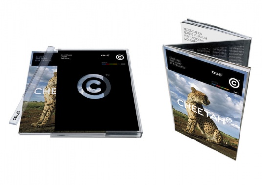 Rebranding - demonstrated by cell-c in South Africa:
It was shortly before the World Cup and South Africa was in a state of ecstasy. The country was brimming over with self-confidence and had just reinvented itself. And so we did exactly the same with the brand - cell-c celebrates South Africa, the land and the people; the colours of the flag were used for the guide system and even the names for products, such as the fastest data product, emerged completely organically from this idea.
(for more see cell-c case study)
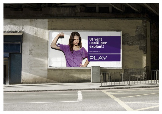 Redesign - demonstrated by Play in Poland:
In 2009 play was the smallest operator in Poland. The brand was perceived as appealing, but its predominant problem was one of credibility. We decided to retain the main design elements, but to piece them together again in a much clearer way. We kept the established corporate colour and even gave it more weight, we reinvented the design element known as the happy blob and transported it into real life. The brand's new identity had suddenly become professional and mature. Recognition stood at 100 percent, just as clear as the brand's intentions of seriously shaking up the market.
Today play is the fastest growing operator in every sector and arguably Poland's most credible provider.
(for more see play case study)